CSS Flexbox

Flexbox
Flexbox is a one-dimensional layout model that provides a method to offer space distribution and powerful alignment capabilities.
- Before flexbox, we align elements using Float and Position Property, It would be a little painful to align items
- CSS Grid is another option for alignment, positioning, etc. So Its good for us to have knowledge of both flexbox and grid (We'll cover CSS Grid in the next blog so stay tuned😊)
Tip:
- Use CSS Grid for overall alignment and positioning layout of the webpage.
- Use Flexbox for inner elements to give alignment and positioning.
Some terms in flexbox, you should know their meaning.
Flex Container: The element that holds flex items.
In simple words, think flex container is parent and flex items is as their children
Rule
- To use Flexbox first we have to write display:flex inside the flex container
<style>
    .flex-container {
             display: flex;
  }
</style>

    <div class="flex-container">
        <div class="flex-items">
            Item1
        </div>

        <div class="flex-items">
            Item2
        </div>

        <div class="flex-items">
            Item3
        </div>

    </div>
Property related to Flex Container
- flex-direction
- flex-wrap
- flex-flow
- justify-content
- align-items
- align-contents
Property related to Flex Items
- flex-grow
- flex-shrink
- flex-basis
- align-self
- align-contents
- order
Alignment Property
To use this property
First, we do flex-direction: row/column [Although By default flex-direction will be always row ]
Remember
justify-content - Always on the main axis
align-items - Always on the cross axis
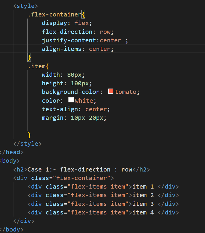
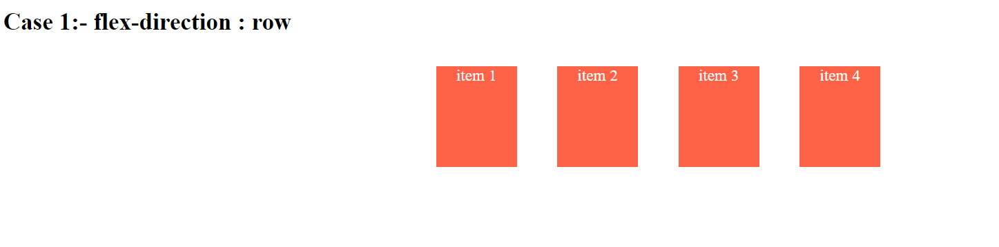
Case 1
- flex-direction: row
1. justify-content:  Always on the main axis -> Horizontally
  // It means if we do justify-content alignment/positioning will be in horizontally

2. align-items:  Always on Cross axis -->    Vertically
  // It means if we do align-item alignment/positioning will be in vertically
Let's visualize:
Case 2
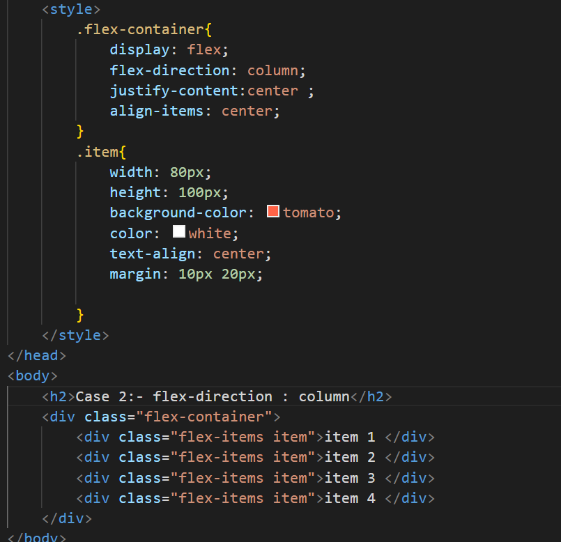
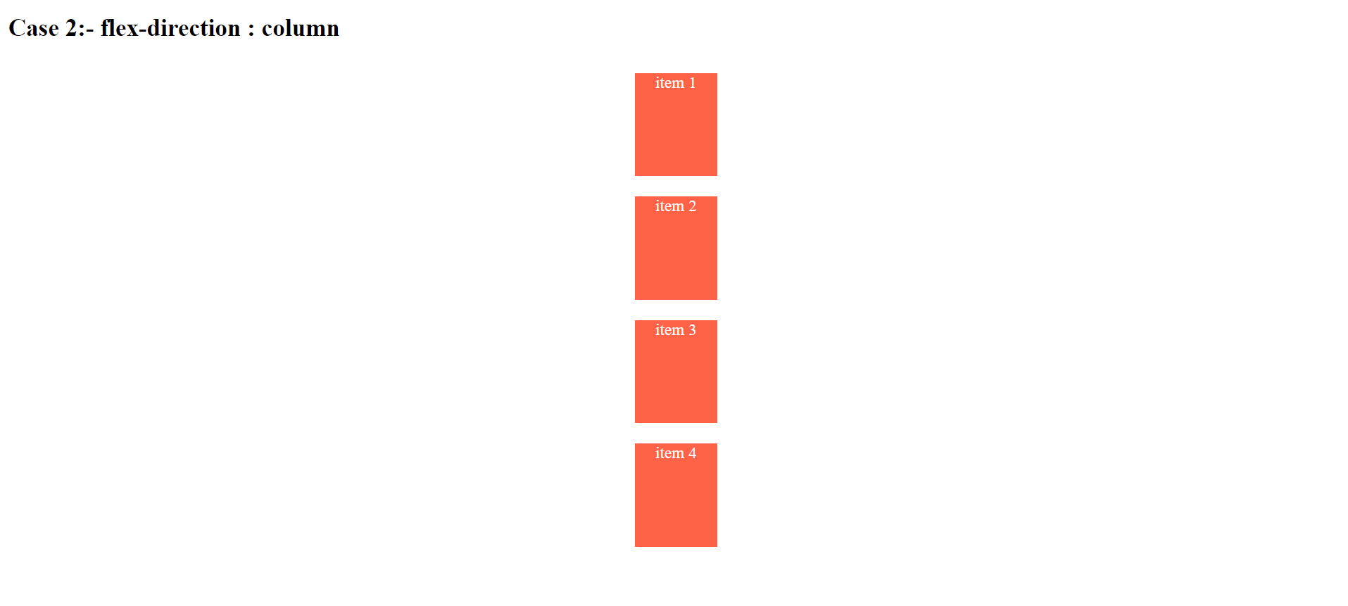
- flex-direction: column
1. justify-content:  Always on the main axis -> Vertically
  // It means if we do justify-content alignment/positioning will be Vertically

2. align-items:  Always on Cross axis -->    Horizontally
  // It means if we do align-item alignment/positioning will be Horizontally

  // In this case positioning/alignment works as the just opposite of flex-direction: row
Let's visualize: